Barbara McManus Demonstration 17th May 2014
Pastel Portrait from Life
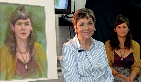 Barbara
is a very distinguished pastel artist. Her portrait work is famous, as is
her life drawing. Her style is overtly pastel rather than photographic
realism. The strokes are there to be seen, the page is not fully coloured
in, giving a painterly looseness and freshness to the picture.
Barbara
is a very distinguished pastel artist. Her portrait work is famous, as is
her life drawing. Her style is overtly pastel rather than photographic
realism. The strokes are there to be seen, the page is not fully coloured
in, giving a painterly looseness and freshness to the picture.
Today she brought along a lovely model, Molly, to sit for her. She was a
beautiful young girl, which is often a problem in itself for the artist.
We often find it easier to get a likeness from a face that is perhaps
wrinkled and lived in. The smoothness of youth and beauty often eludes us.
But Barbara did a great job and produced a delightful portrait with an
excellent likeness.
She does no drawing at the start, rather blocking in areas of colour quite
lightly and loosely. She had chosen a pale green board and allowed it to
show through in much of the picture. It was complementary to Molly's skin
and to the dark red dress she wore.
Barbara had a light touch on the paper. As the face took shape she made a
highlit ball on the nose, explaining that the nose is the closest thing to
you so you have to bring it forward. The ears are thinnest so they show
more blood, hence you make them redder than the face. The nostrils are not
black holes so you add some red. The eyebrows are made of hairs so they
are not one continuous line. The mouth is done with vertical strokes
rather than as a horizontal line because if you look at lips that is the
way they are. There is not a pure white in the whites of the eyes, rather
a pale flesh colour. These explanations of the reason behind art decisions
make Barbara an excellent teacher. Not every artist is able to verbalise
their reasons, if they actually have any reasons other than intuition.
One aspect of her method was this: If you pick up a pastel, try it for
colour out of the picture then use it wherever you can see that colour in
the picture. Go to various parts of the picture before you put it down and
have to search for it again later. Pastels get dusty and can be hard to
find again once you put them down. Good tip. That means that she was
keeping different parts of the picture going at once.
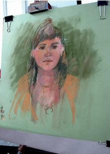 She
threw in some of Molly's dress colour and some of the background colour
well before the face was finished. We often say, "I can't do backgrounds".
Well, this method helps and it unifies your picture as bits of the same
colour appear in both the main image and the background.
She
threw in some of Molly's dress colour and some of the background colour
well before the face was finished. We often say, "I can't do backgrounds".
Well, this method helps and it unifies your picture as bits of the same
colour appear in both the main image and the background.
I noticed too that she rubbed the background with a tissue but did not rub
on the face. So there was a nice out-of-focus feel about the background,
which is what you want.
As a pastel artist she was very conscious of layers. Thinking ahead she
would put down a darkish colour knowing that later she would go over it
with a lighter one. Having chosen a green paper she knew that the face
would look sickly if she did not emphasize the redness of the flesh
colour. Pink can come in over that later.
Her answers to incidental questions showed her expertise in pastel brands
and qualities. The audience seemed to be mainly pastel students so they
were very well pleased with the demonstration. Once again it was an
excellent afternoon. Barbara said that she was amazed at the size of the
audience. Whitehorse continues to build a great reputation for its
demonstrations.
Colin Browne, WAA Secretary