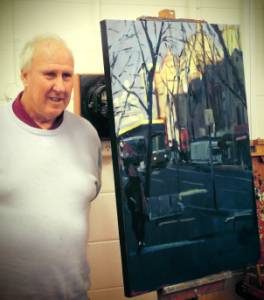
Clive Sinclair Demonstration, Saturday 18th July 2015 Landscape in Oils
 Clive was a
cheerful, warm person. He has been professionally involved in art for
the best part of his adult life, as signwriter, tonal painter, student,
teacher, watercolourist and oil painter at different times.
Clive was a
cheerful, warm person. He has been professionally involved in art for
the best part of his adult life, as signwriter, tonal painter, student,
teacher, watercolourist and oil painter at different times.
Now he is
into minimalist impressionism, to give it a name, but you can never
predict what a contemporary artist will produce. That is what
‘contemporary’ means. His credits are numerous, one of the Twenty
Melbourne Painters, Vic Arts award for Painter of the Year in 2012,
tutor at V.A.S. and Peninsula A.S., and numerous prizes in major art
shows.
He is well-read as an art historian and not only impressed
the audience with his art but kept them amused with anecdotes. Some
were about Max Meldrum, some about the bohemian life of Australian
artists of the early 1920s and in particular about the female artists
of the time, who were whole heartedly into that lifestyle, as well as
producing great art. He mentioned Clarice Beckett, Alice Bale, Betty
Davidson, Margaret Preston and others as great women painters of the
period.
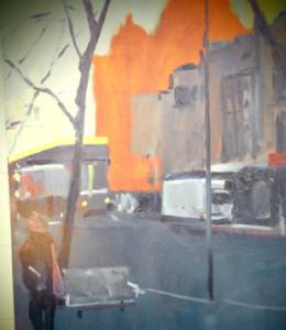
Today it would be a street scene in oils. He had taken a
photo of a Melbourne street corner with Flinders Street Station in the
background. It was three quarters in shadow but had good light and dark
contrast.
Discussing it he said that he had studied Meldrums’s tonal
realism and valued it, not so much as an end, but as a very good basis.
From there it depends where you go, how much work you put in, how you
develop along your own road. In this case he would begin with simple
shapes and tones. There was no preliminary drawing, just a blank canvas
to start with. It was an old one painted over with a warm red as a ground,
rather than white. He would allow the red to come through in parts.
He used raw umber with a big brush to scrub a few areas in. The horizon
line is critical, a decision to be made. He used ordinary turps as a
medium. You could use stand oil, which is boiled linseed oil left to stand
outdoors for a year until it is luscious.
There was no drawing, just
painting in mass. Sometimes he uses a two inch house painting brush for
this stage. Very loose. If you start precise you can’t change things,
he said. He threw in a top corner of Prussian blue mixed with white for
the sky. Then some indigo to mark the buildings, but leaving the domes of
the station the base red. The underpainting was now fully covered. The
next stages will be enjoyable as the paint will slide on now.
He mixed
cadmium yellow and yellow ochre and put it against the darkest darks. He
has simplified it a lot but it was still just shapes. Squinting helps
you to see the basic shapes. Turning the photo upside down helps in the
same way.
 Verticals are most important in a painting. They pull it together. One
that came right down through all the shapes gave it an illusion of
depth. Any drawing of branches or figures etc. was done with the brush,
live, not pre-drawn from the beginning.
Verticals are most important in a painting. They pull it together. One
that came right down through all the shapes gave it an illusion of
depth. Any drawing of branches or figures etc. was done with the brush,
live, not pre-drawn from the beginning.
He attended now to the
buildings in light (the station). Til now everything had been a darkish
blue grey, but once the yellow of the lit buildings hit, it put a new
significance on the parts in shadow. The composition now became a
balance of light and dark on a diagonal with the weight on the lower
dark part. You don’t need an equal amount of light tone to make a
satisfying balance.
He left it there, a striking moody street scene
with broad areas of light and shadow in an interesting balance. It had
been a very informative demonstration. Thank you Clive.
Report by Colin Browne