GREG ALLEN demonstration 16th
April 2016
Watercolour Landscape
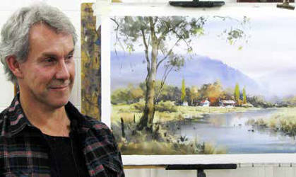 Greg is one of our tutors. He comes to
Whitehorse on Wednesday afternoons and evenings. We are very
privileged to have him as he is an internationally famous artist. He is
a member of the ‘Twenty Melbourne Painters’, leads painting tours for
‘Australian Artist’ to exotic places and has won top prizes in the most
prestigious art shows. But he loves Whitehorse Arts and feels really at
home here.
Greg is one of our tutors. He comes to
Whitehorse on Wednesday afternoons and evenings. We are very
privileged to have him as he is an internationally famous artist. He is
a member of the ‘Twenty Melbourne Painters’, leads painting tours for
‘Australian Artist’ to exotic places and has won top prizes in the most
prestigious art shows. But he loves Whitehorse Arts and feels really at
home here.
Today he took an adventurous step with his demo. No
reference photo, no prepared subject, an impromptu watercolour based on
ideas that the audience threw at him. It was a risky thing to do
because it could have left him high and dry. But the advantage of his
choice over a formal lecture/demonstration was that it unlocked his
lively personality and engaged the audience’s minds so much more. It
worked.
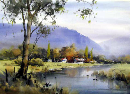
Audience participation. You can’t beat it. He had us decide
on a landscape or a seascape. Landscape won. Where? Suggestions
included Yarra Valley, Bright, Mornington Peninsula, Northern
Territory, the Dandenongs … Bright won. In autumn. “OK it’s your
decision. You have ownership of the game, I am just providing my
skills.”
He began with some basics about design. You need a focal
point. Maybe a group of farm houses with autumn trees around. Avoid
symmetry. We are drawing shapes so we want variety of mass. On scrappy
paper with a sloppy brush he built up a sketch plan. A serpentine line
will lead the eye into the picture. So he made a river to do that.
Trees to the side may be useful to keep the eye from wandering out of
the picture. Eye movement is an essential part of design. All the time
he was adjusting his sketch plan. The horizon line should not be midcentre. Generally it will be high for seascape, low for a
landscape. Think in thirds.
With colour you have to have them prepared
beforehand. Watercolour is a dye. It won’t come out if you get it
wrong. The lesson is that you must have worked out exactly what you
are going to do before you start. Then go for it. Fast. No revisions.
Get it right first time. “A la prima”.
Then he asserted that there was
another essential step before committing yourself to the valuable watercolour paper. Before you start you need to make a colour visual.
Talking about colour he said that warm colours come forward, cool
colours recede. The back mountains will be blue, the front trees will
be green, but what is the colour of the trees about 5km away. Not blue,
not green. A sort of greyish green. We are painting light and with
watercolour it is safest to go from light to dark. Where in our world
is it lightest? The sky. Then where? The horizontal areas. Where is it
darkest? The verticals and under them. So that is the plan of attack.
Still on colour he fixed a scrap of watercolour to the side of his
board. That was his test sheet. Always test your colour there before
you commit it to the painting.
 Having made a small coloured version of
the sketch plan he turned it upside down. Look at that. Does it work?
You can often see problems with the design by doing that. A mirror is
also good. So with all of these important ideas rattling around in our
minds we went to afternoon tea, leaving Greg to sketch it all out in
pencil on a big sheet of 300gsm Arches rough.
Having made a small coloured version of
the sketch plan he turned it upside down. Look at that. Does it work?
You can often see problems with the design by doing that. A mirror is
also good. So with all of these important ideas rattling around in our
minds we went to afternoon tea, leaving Greg to sketch it all out in
pencil on a big sheet of 300gsm Arches rough.
On our return he was
ready to go. Quickly. He says that if a watercolour takes more than
half an hour it fails. It is too laboured, too tight. With his board
vertical (for demo and teaching purposes he has mastered this technique
although it is not ideal for the beginner) he wet the paper, more or
less all over (although I know he must have left some dry edges around the
farmhouse and other places. Why? Because he had previously said that
you must plan beforehand where your edges will be. If you want a soft
edge you will prepare wet paper, if you want a hard edge you will
prepare dry paper). Simple? I don’t think so. The tricks of the trade.
Another one that you might not have noticed is that when he mixed a
colour he put that brush aside. The next colour had its own brush. If
you are about to do a graded wash you must have all the colours on
different brushes so you can go fast. He was about to launch his attack
but not until he was completely prepared. The colours had been
tested on the test sheet. Then…fire the gun and go!
Excitedly he threw colour on to the paper. Some edges merged, some were dry and hard. The
light washes described the sky, water and tops of things, the darks
described the verticals and underneaths. Reflections on the river were
less obvious than the thing they are reflecting. Many of his best
grasses were an upward flick of the square brush, or his best
reflections a downward wipe of his finger. The odd fingernail scratch
comes in handy too.
“Beautiful!” said the audience. “Boring”, said
Greg. He was determined to put a tree in. We groaned when he dragged
a wet brush through his perfect mountains. But a few minutes later
there was a gum tree with floaty leaves and scumbled canopy. The final
result (all done by us, he said) was an excellent watercolour
landscape. Another great performance Greg. Thank you.
Report by Colin Browne