Peter smales Demonstration
15th October
2016
Maritime Painting in Oils
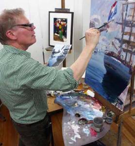
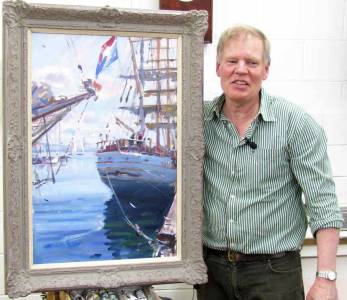 Jovial oil artist Peter Smales was making his
return visit to Whitehorse after three years. He had left us with a
very positive impression of both his talent and his personality. He is
a member of the 20 Melbourne Painters which is a very significant
honour. His work is colourful and painterly, eschewing tight detail. I
well remember his one inch square brush paintwork from last time.
Jovial oil artist Peter Smales was making his
return visit to Whitehorse after three years. He had left us with a
very positive impression of both his talent and his personality. He is
a member of the 20 Melbourne Painters which is a very significant
honour. His work is colourful and painterly, eschewing tight detail. I
well remember his one inch square brush paintwork from last time.
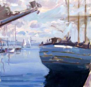
(left & below right) Sketch and reference photo
However, today he was inspired by the visit to Williamstown of a tall
three masted sailing ship, of which he had a taken a good reference
photo. He had done his
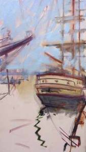 preparation with a paint sketch on an mdf board
to which he had glued light canvas with aquadhere. The lines had to
be strong because he would lose them as he goes over them in the early
stages if they weren’t. However that sketch stood by while he gave us a
few of his principles.
preparation with a paint sketch on an mdf board
to which he had glued light canvas with aquadhere. The lines had to
be strong because he would lose them as he goes over them in the early
stages if they weren’t. However that sketch stood by while he gave us a
few of his principles.
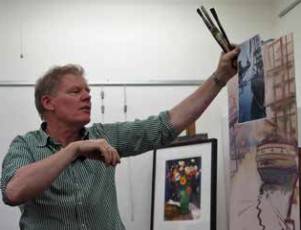
Art is not just representation. The main thing is not what you paint but how you express it in your medium. It should have rhythm, colour, vibrancy. To illustrate this he showed us a recent painting of his back yard. It was loose and incomplete but he was able to make points about balance, composition, eye movement. He said that the eye will be engaged by contrast. True. And you want to keep the eye moving inside the picture frame. Peter had good teaching points, well delivered.
Before he actually painted anything he explained his palette which was arranged in the colours of the rainbow with warms and cools of each primary plus some darks. On a scrap he showed us how to build up a colour wheel. Plenty of titanium white in the middle. You can make up your own blacks rather than squeeze them out of a tube. On to the picture....
 His approach was to go from the
back to the front. He scrubbed in big values first. A tonal painter
squints his eyes and works big and loose at this stage. A good
teacher keeps up a running commentary all the time. Peter did.
His approach was to go from the
back to the front. He scrubbed in big values first. A tonal painter
squints his eyes and works big and loose at this stage. A good
teacher keeps up a running commentary all the time. Peter did.
Background
His
experience and observation brought out comments about the effect of
distance on light and shade, contrast, brightness of colour, focus,
warm and cool.
 So while these gems were coming out the canvas was
showing a convincing story of the sky, clouds and sea. These star
demonstrators have it down pat. They can run their talker and their
painter at once to produce a great performance. We couldn’t. No way.
Remarkable.
So while these gems were coming out the canvas was
showing a convincing story of the sky, clouds and sea. These star
demonstrators have it down pat. They can run their talker and their
painter at once to produce a great performance. We couldn’t. No way.
Remarkable.
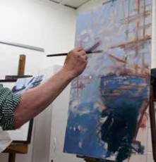
Even though he knew that he would be going across the background with lines and shapes of the ship’s masts and stuff he was careful to get the background right first. It was bright and sunny. OK. Done.
Detail in background
 Deep breath. Now for the darker stuff. The dark mass of the
ship. Bits of the pier.
Deep breath. Now for the darker stuff. The dark mass of the
ship. Bits of the pier.
Detail in foreground
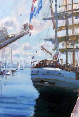
He had to be brave to go over the good work that he had so carefully done. But it was worth it for the feeling of depth that it gave the picture. Dark shapes against light, and light shapes against dark resulted in a luminous glow against the sky. We realised now how good composition adds interest. The ship was part inside, part outside the frame and slightly angled. Dynamic.
 Nearing
completion
Nearing
completion
When he produced a heavy ornate frame to place around it, it drew a spontaneous burst of applause.
Report by Colin Browne