WAA End of Year Art Show
December 2021 Winners
Shown below are the winning entries. For the Highly Commended Awards, see the full show gallery page, the link
is at the bottom of this page. A big thank
you to our talented artists for continuing to produce amazing work
during COVID, and to our hard working Committee for making the show
possible.
And special thanks must go to our judge, Sharon
Martin, who provided most insightful and helpful comments. Here are some
of her introductory remarks:
"It is an honour to be asked to judge
Whitehorse Arts Association’s Annual Awards and I would like to thank WAA
for this great privilege. First of all, I would like to commend everyone
who has entered a drawing or painting to be judged. The judging process is
fraught - how can one judge the heart and soul of an artist who is showing
us all a piece of ‘who they are’? It is a courageous thing to be an artist
in the first place and especially entering your work to be judged.
A
former tutor of mine (some of you will remember her – Agata Lelek), told
me many years ago…. “Sharon, you must show your work, no matter what level
you are at – it will help you develop a thick skin”. And I especially find
those comments relevant in the early stages of learning to become an
artist & when it can seem disheartening not to be included on the awards’
list. Congratulations to all of you for being brave and putting yourselves
‘out there’.
In Judging, what I am looking for in a painting is
something that ‘draws me in’. Does an artwork make me pause and want to
look at it longer. Is there an approach that keeps me held there exploring
the work, is the work telling me a story? Most importantly of all, I am
looking to a work of art to make me feel something"
Click on the thumbnail images to see the
enlarged images with captions.
Best in Show
|
|

| Arrangement in Greys, by Askolds Peterson
I was torn between the two paintings that Askolds entered, as to which one to
award - they are both brilliant works. His painting ‘Backstage’ reminds me of
the expressive works of the master Egon Schiele, but it is the humanity in the
work of ‘Arrangement in Greys’ that I decided to award Best in Show. One of the
marks of a very accomplished artist is their ability to handle ‘greys’ in a
painting. For me, it is a great pleasure to see them used with such competency
in Askolds painting. Initially I am drawn to the interesting strong vertical and
horizontal directional lines. And then to the warmest colours on the cheeks of
the face and the myriad of subtle colours used there. I am cleverly taken around
the painting, then drawn to the focal point of the subject, the face. I
particularly like the mark making in this work which is very interesting and
gives this painting a contemporary feel. The sitter’s hands are beautifully
done, showing us how skilled Askolds is, in painting the human form. The sitter
is gazing out from her seated position and it is the eyes I am drawn to,
wondering what she is thinking about, what kind of life has she lived? |
Works on Paper
|
|
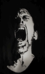
| First: Rage, by Laurie Dusting
The viewer is immediately struck with the force of the image on
the paper, as the title ‘Rage’ suggests. The proportions of the
face are good and the expression is excellent The mood of the
portrait is very convincing. It is unusual to see such a
strikingly emotional portrait and I came back quite a few times to
look at this one.
|

|
Second: Simba, by Darelle Tenace This scratchboard work is very well drafted - the shape of the
head is rendered showing correct proportions. Light and contrast
are used well and variation in tone is accomplished. As well as
perspective, we see tone used convincingly for the turning of the
head & undulations in the coat of fur. A lovely portrait of a
‘Simba’ the cat.
|
|
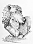
Third: Red, by Ann
Fiedler
This black pen and ink portrait of ‘Red’
captures a beautiful & convincing expression of the ‘sitter’. The
pen strokes have been used consistently and well, and following
the shape of the dog’s coat - it would be very easy to overdo
their use, so congratulations Ann for holding back where
appropriate. Tone and form have been understood well. The silky
softness and wavy fur of the coat is convincing and Red is
grounded well on the paper plane. But it is those beautiful gently
eyes that keep bringing me back to this one. |
Watercolour
|
|
 |
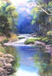
First: Whispering Warrandyte, by Deborah Allison
This scene evokes the feeling of a cold early morning or rainy day
along the banks of the Yarra River. It is an extremely well
executed painting, showing a high level of competency in the use
of the medium of watercolour. I especially like the depiction of
shadows and way the trees have been accurately reflected in the
water. One of my favourite elements in this painting is the use of
a variety of mark making - including scratchy grasses, fine
strokes of dark for smaller tree branches, whites of the paper
left for tree reflections, loose watercolour softness of the
foliage and then the wonderful mass of dark ‘spots’ (probably done
with a toothbrush or brush) overlaying the shadows and reflections
in the river in the bottom right of the painting.
|
 |
Second:
Wally deep in Thought, by Christine Lacreole
How does one paint white fur on white paper? Christine shows us
how by using a very dark contrasting background against the
subject. The background has been kept loose so that we get the
effect of it appearing in the distance. The subject matter is
compelling……….I am drawn in, wondering what is Wally thinking
about.
|

|
Third:
Early Morning on the Canal, by Greg Burns
Here is a work that exemplifies ‘simple is best’. Using a limited
palette Greg has captured the feeling of the light in the early
morning by using strong contrast in the shadow areas. The shadows
also reveal changes in hues that are both simple and interesting.
A quick and successful plein air sketch that maintains a loose
approach very well. |
Oils & Acrylics
|
|

| First: Spring
Blossoms, by Carole Lees
Carole shows great skill
in the painting of her flower subject, using line, detail & high
contrast in the area of the focal point - the lightest flower
There are delightful passages of light that draw us around the
painting and make us look further. Great contrasts between hard
and soft edges, light and dark, and the lovely colour choice of a
complementary colour scheme of reds for the subject and greens for
the background. The background has been left soft and blurred so
as not to detract from the subject. I also like the diagonal
placement of the subject which gives the painting a dynamic
effect. Congratulations Carole – a beautiful painting.
|
 |
Second: Hold Beauty In Your Heart, by Rosemary Price
The title of this work is a message that
is quite profound and in these current times one that many of us, as artists, find
satisfying and distracting in our art - looking for and focussing
on the beauty around us in a troubled world. Glass is a subject that is very difficult to paint well and Rosemary has shown us how masterful she is with
observation, technique and very careful rendering. The camellia flower is beautifully painted with very subtle
colour transitions and the whole subject really 'pops' against the dark background.
|

|
Third: Koi Fish,
by Natalie Dubrovski
Natalie has shown us a
contemporary painting approach to her subject, with lots of
colour, texture and movement in her work. The Koi are vibrant and
interesting and painted very well. I particularly like the
squiggly marks of white paint layered over the top of the fish and
the modern, semi-abstract style of water in this painting. A
well-known subject painted very well. |
Tutors Artworks


Follow the link below to view all the artworks entered:
Copyright © 2021 Whitehorse Arts
Association
All rights reserved.


