Peter Smales demonstration 21st September 2013
Seascape in Oils
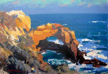
One of Peter's Great Ocean Road Paintings
Peter was a very pleasant affable personality. His amusing delightful manner kept the attentive audience laughing. He is a very good teacher, handling the overcrowded room competently without a microphone. He is a member of the Twenty Melbourne Painters, which speaks for itself. He told us of his progress as an artist. At first you are content to copy and try to get it as close to realistic as possible. With experience you go for more than just an accurate copy, you manipulate composition to suit your taste and try to capture light, which changes the look of things all the time. In time you develop a style by which others can recognise your work.
His style, I think, is a painterly, blocky, colourful style. It stops short of photo realism, which is his own decision, as he favours the work to be obviously a painting rather than a photograph. He doesn't get down to fiddly detail. Partly this is the result of his using a square ended one inch brush most of the time. We didn't see any riggers or small round brushes. That shows up in his style. “A small brush makes you pernickety.”
He discussed his palette. You need both a warm and a cool of each of the primaries, red, blue and yellow. Those six enable you to mix almost any colour. The fact of limiting yourself to those six will give your painting a pleasing colour harmony. You could see that in his demo painting, which was of a cliff scene on a rather misty day - some of the Twelve Apostles along the Great Ocean Road.
His painting surface was cotton canvas glued onto MDF with aquadhere and prepared with a light mushroom tint.
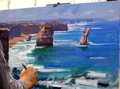 The
demonstration work in progress.
The
demonstration work in progress.
He started by putting down in lilac a sketch of the areas - just the major shapes. He chooses lilac because it is halfway between the foreground warm colours and the background cool colours. Although he held a photo to go by, he made changes to it to avoid traps like repeated items, centralised focus, symmetrical placement of objects and taking the eye out of the picture frame. He explained many valuable ideas, such as aerial perspective, whereby as you look back into the distance you lose yellows first then reds and finally everything turns to blue. In water the furthest colour is ultramarine and it becomes greener the closer it gets to you. With overlapping shapes the closer ones are sharp edged and they go out of focus as they recede. In fact, he said, an artist can stand on a cliff just looking for ages. The skill lies in how accurately you see things.
We should keep an eye on the tone relationships all the way through. If everything is painted too sharp the painting will look very flat. Also we should not be too specific with one part of the painting to start with because we don’t know how it relates to the rest. Our aim should be to take our painting a bit further; not to make it look like a photograph. We should show we’re putting paint on so that it looks like painted marks. If we smooth it out it loses its life. Tune up the tone values so that they sing. This gives it the bewitching feeling of half paint half reality.
 An
interesting observation is that photography has come so far that we need
to think what else we can do with paint.
An
interesting observation is that photography has come so far that we need
to think what else we can do with paint.
He painted his picture in stages, working all over the picture. It is at first very sketchy, then he puts in very broad areas of colour, then comes back into areas with finer detail. He could go further into detail but prefers to call a halt when it looks like a painting not a photograph. "Leave a bit of breadth," he said. "The eye needs some areas where it can have a rest." A most popular demonstration.
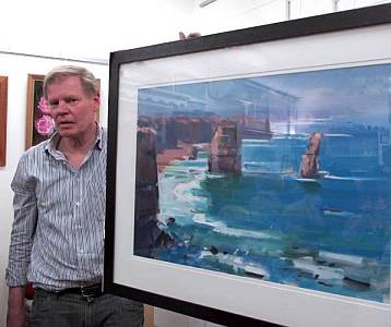
Colin Browne & Helen Halliday
Peter and the finished demonstration artwork