Pamela Pretty Demonstration, Saturday July 16th, 2022
Pamela is an experienced pastel artist and teacher. Good teacher that she is, she spoke confidently and interestingly about her art and gave lots of valuable tips and ideas relevant to today’s task, which was to demonstrate light on water in a quiet, still waterscape. She has a pleasant manner and makes good contact with her audience, asking lots of questions, giving sound answers.
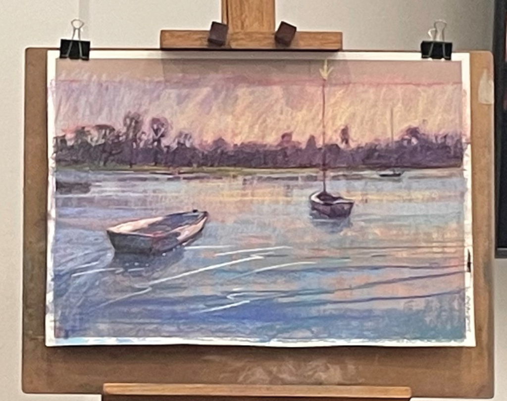
She aimed to produce a mood of peace and quietness in this painting. The moods of water are many and varied, “it is like music”, she said. When you think of the different symphonies and how their movement have ever changing feelings, she is right. In art the famous depictions of water, be it Turner, Kanagawa, Constable or whoever, the variation is incredible. Today it was to be serenity, with two boats at rest on a still bay. The key to making a good waterscape is first of all, observation. She has noticed that water may be observed various ways, with the bottom showing through, eg. the sand, or with its depth playing a part as shallow moves into deep, or the surface, which may be smooth or wrinkled or rough.
The state of the sky plays an important part in the colour of the water. You don’t get a bright blue sea on a dull cloudy day. And there will be reflections. The science of reflections is a study in itself.
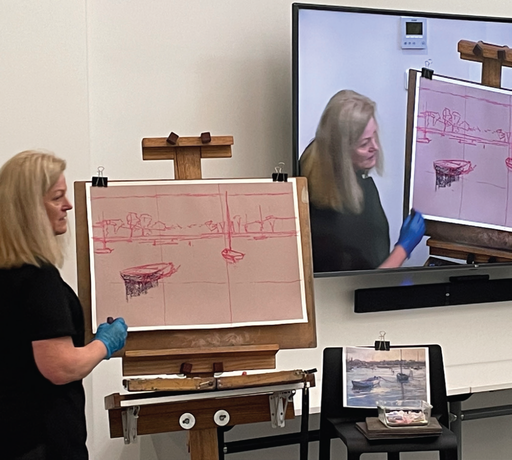
Putting that knowledge on paper is quite a skill. It makes a big difference what colour ground you use. Today the ground was a pinky taupe, and her sketch was in bright pink. All to be lost in the long run. The horizon was a bit above centre at first but later she decided to cut out a strip of sky making the composition wider, probably helping the serenity of mood.
To decide on the composition she invoked the theory of thirds and placed the boats on intersections where they would be good focal points.
Some general hints for beginners buying a new kit of hard, medium and soft pastels, their brand names and their qualities were very welcome.
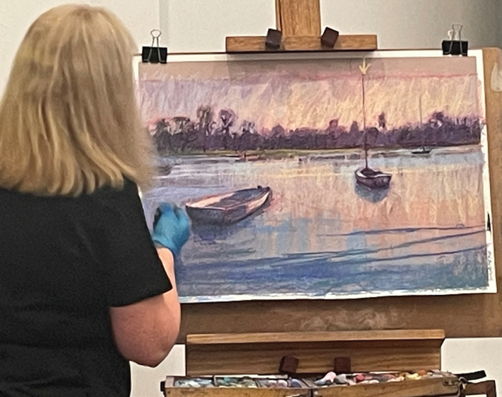
Down to work on the painting. The sketch done, the dark pastel colours went in first, lightly and loosely. The light pink of the sky would be reflected in the water. The strokes for the reflections were verticals: an interesting decision, possibly part of the science of reflections. She said that she doesn’t use much green in her paintings. Many artists find green a problem. Where the land meets the sea she puts a streak of light. Behind the trees there was a diffused light of blue purple, picked up on the water. Plenty of holes in the trees. Darkest dark against lightest light. She said she doesn’t like to make the corners of a painting too sharp, in keeping with science which tells us that our peripheral vision is less clear. A good teacher tells you why, not just how to do it.
During the break she worked on the blue at the bottom of the picture. The boats emerged with sharper detail. Close to the finish she put in strokes with soft light pastel but warned against overdoing it. Fewer strokes will keep it fresh. The final picture was quite lovely, achieving the mood she had aimed for. It had been a most informative and absorbing demonstration. Thank you Pamela.
Colin Browne